Apprentice Magazine
Art-directed onboarding — for the people just arriving.
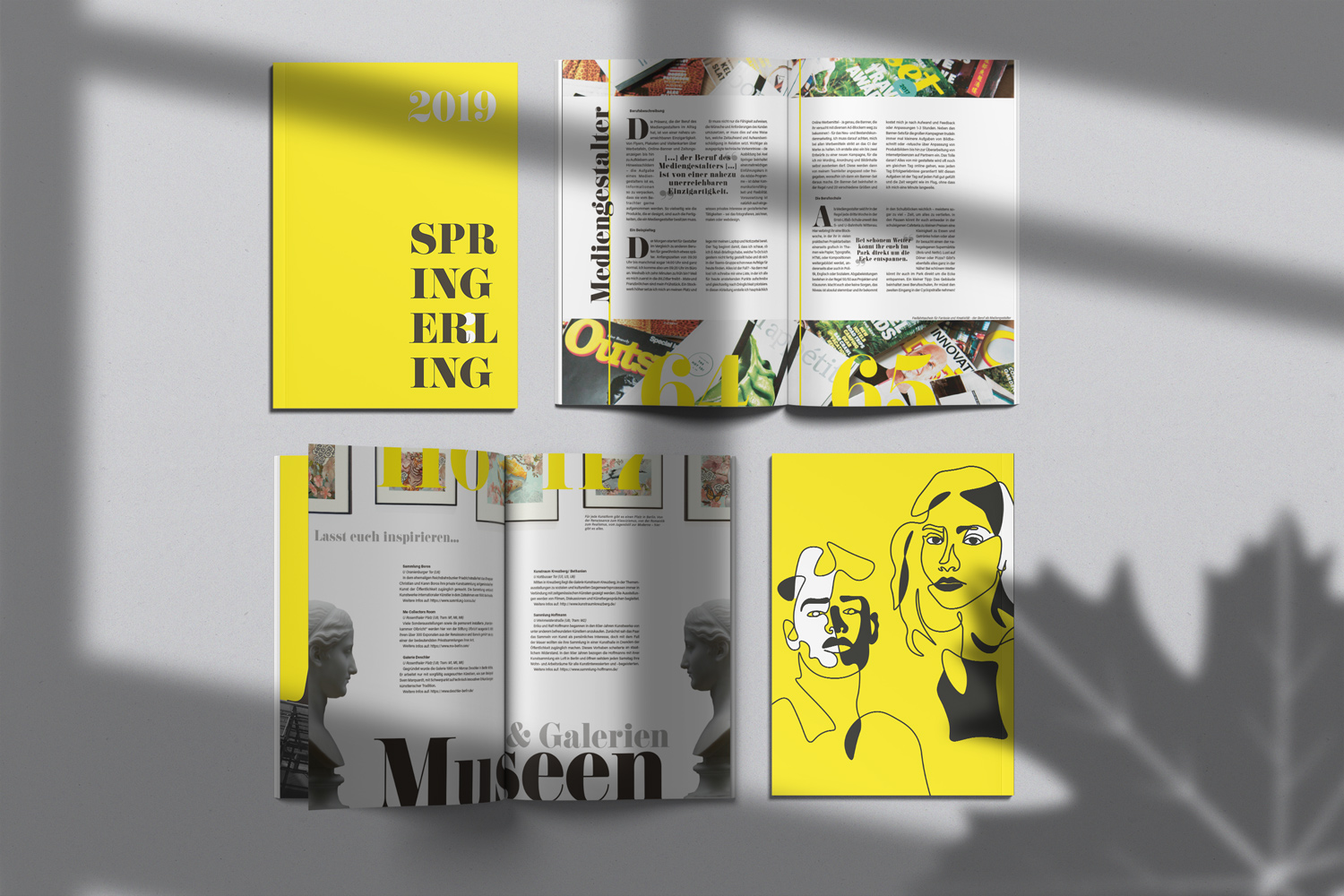
The brief
An onboarding magazine that doesn't read like one.
Every first-year apprentice at Axel Springer makes a magazine for the incoming cohort. The brief is always the same: onboard the next generation — cover the executive board, the subsidiaries, the works council, life in Berlin, and introduce everyone in the new intake through personal profiles. The challenge is making something that actually gets read.
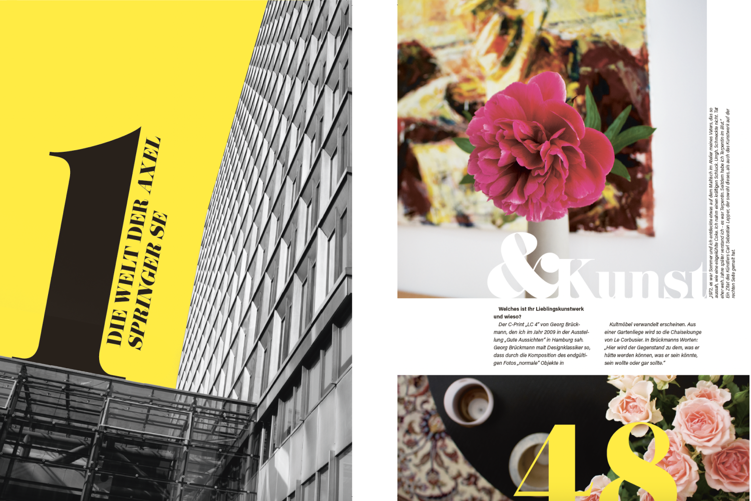 Img 01 · Some pages
The approach
I took on the role of design lead — which meant setting up the InDesign file, establishing the visual system, and coordinating a team of three other media designers through production. I also wrote two of the articles myself.
The design direction was deliberately against type for a corporate onboarding piece. The aesthetic draws from art and culture magazines — considered layouts, strong typographic contrasts, editorial photography, and a visual confidence that treats the reader as someone with taste. The goal was a magazine people would actually keep.
On the production side, I handled the full print workflow: communication with the print shop, press-ready file preparation, colour management, preflight checks, and proof prints. The cover was finished with embossing and gloss lamination — a detail that sets the physical object apart before anyone has opened it.
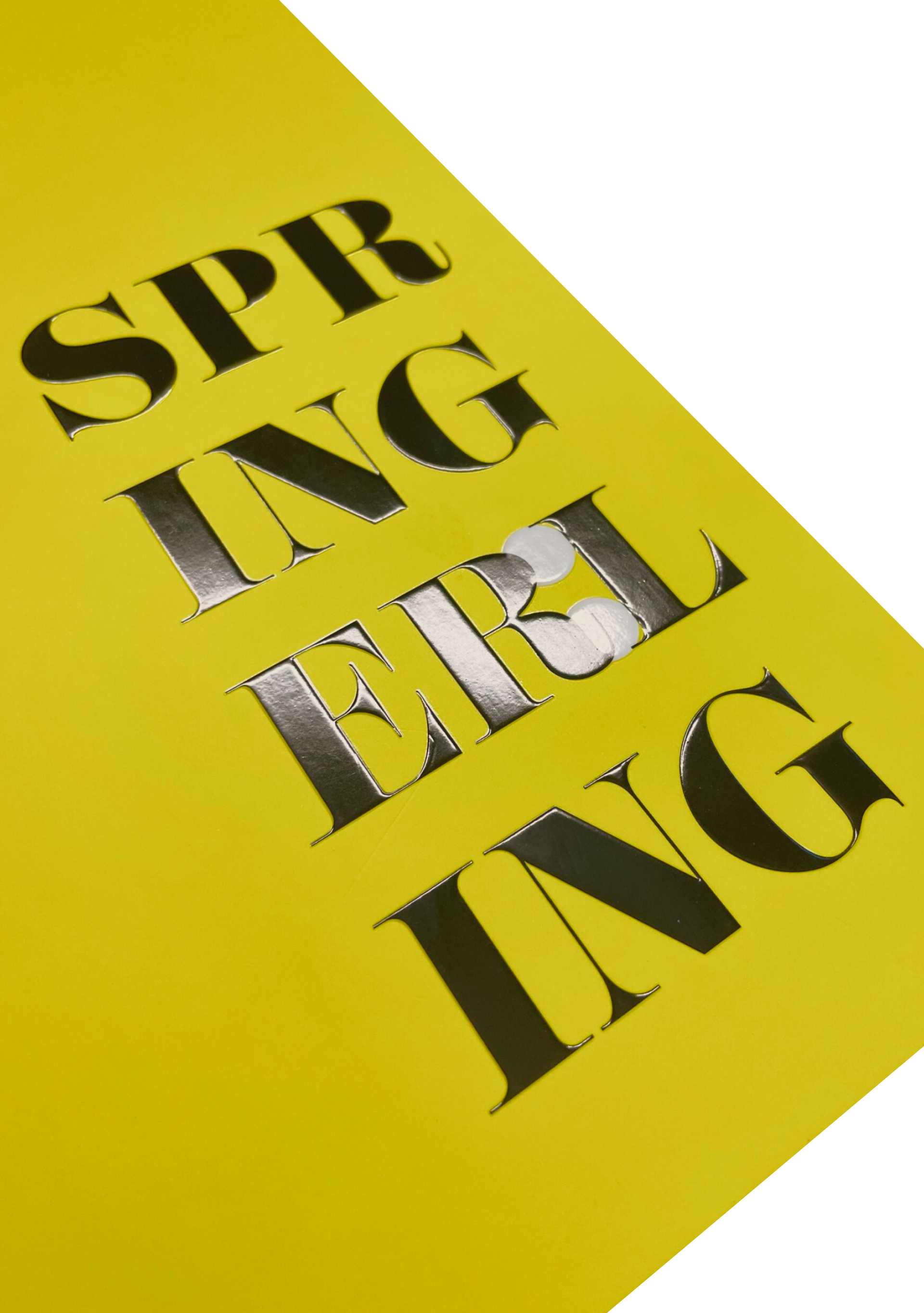 Img 02 · Front cover
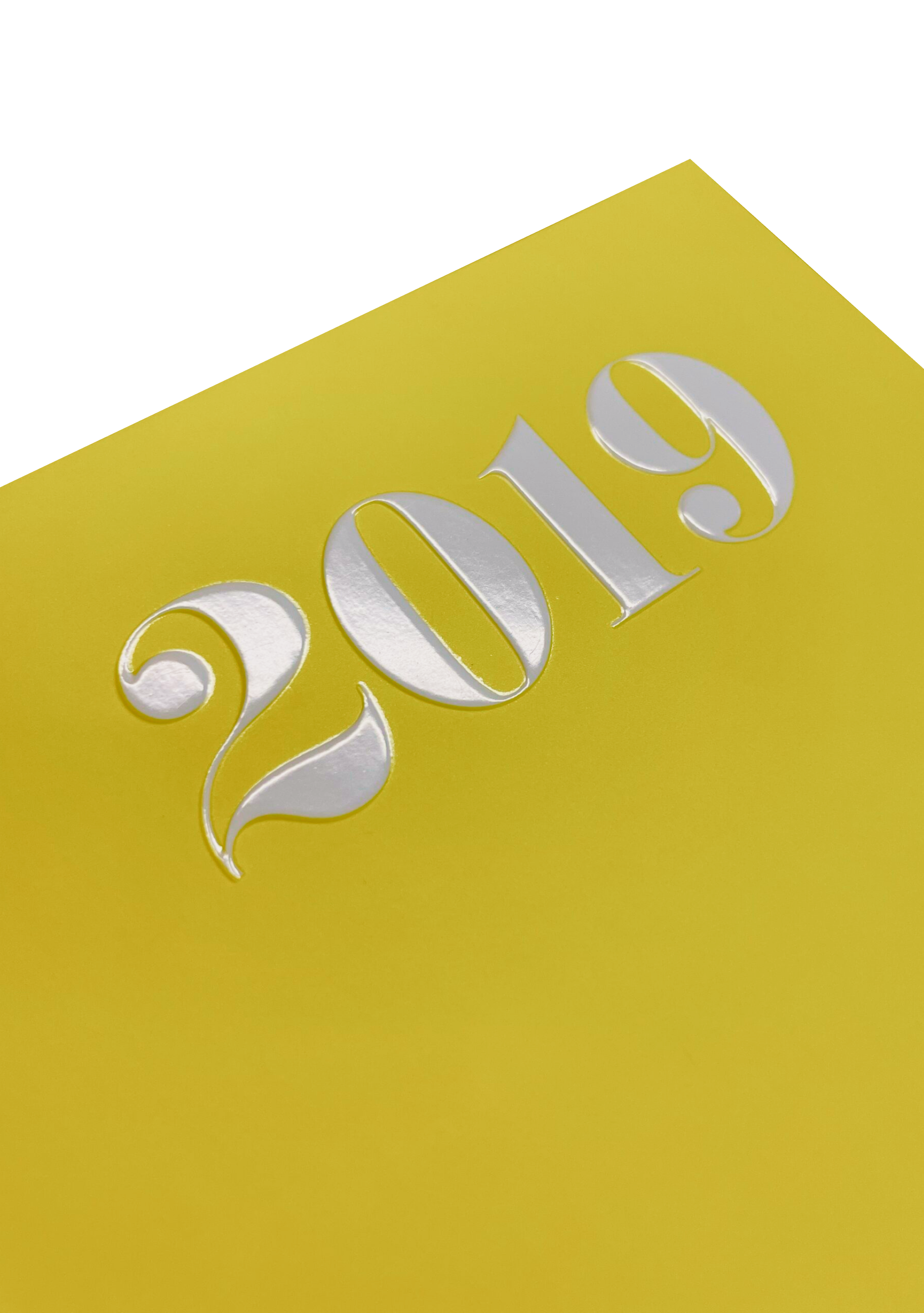 Img 03 · Embossing and gloss lamination
The outcome
A 148-page magazine that doubles as an introduction to one of Germany's largest media companies — designed to feel like anything but internal communications. Delivered on time, print-ready, and with a cover finish worth running your fingers over.