HTML / CSS Onboarding
From user research to in-app message — a custom HTML/CSS template system built to promote undiscovered features in the WELT News App.
The brief
Built to promote what already existed — because good features deserve to be found.
Not every feature ships with an audience. User research had surfaced a consistent pattern in the WELT News App: several core features — personalisation, push notifications, author follows — existed and worked well, but weren't being discovered or used. The goal was to change that through in-app messaging, without disrupting the reading experience or overwhelming users with notifications.
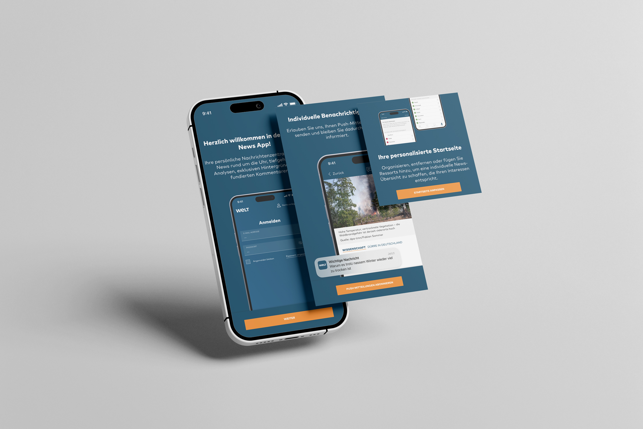
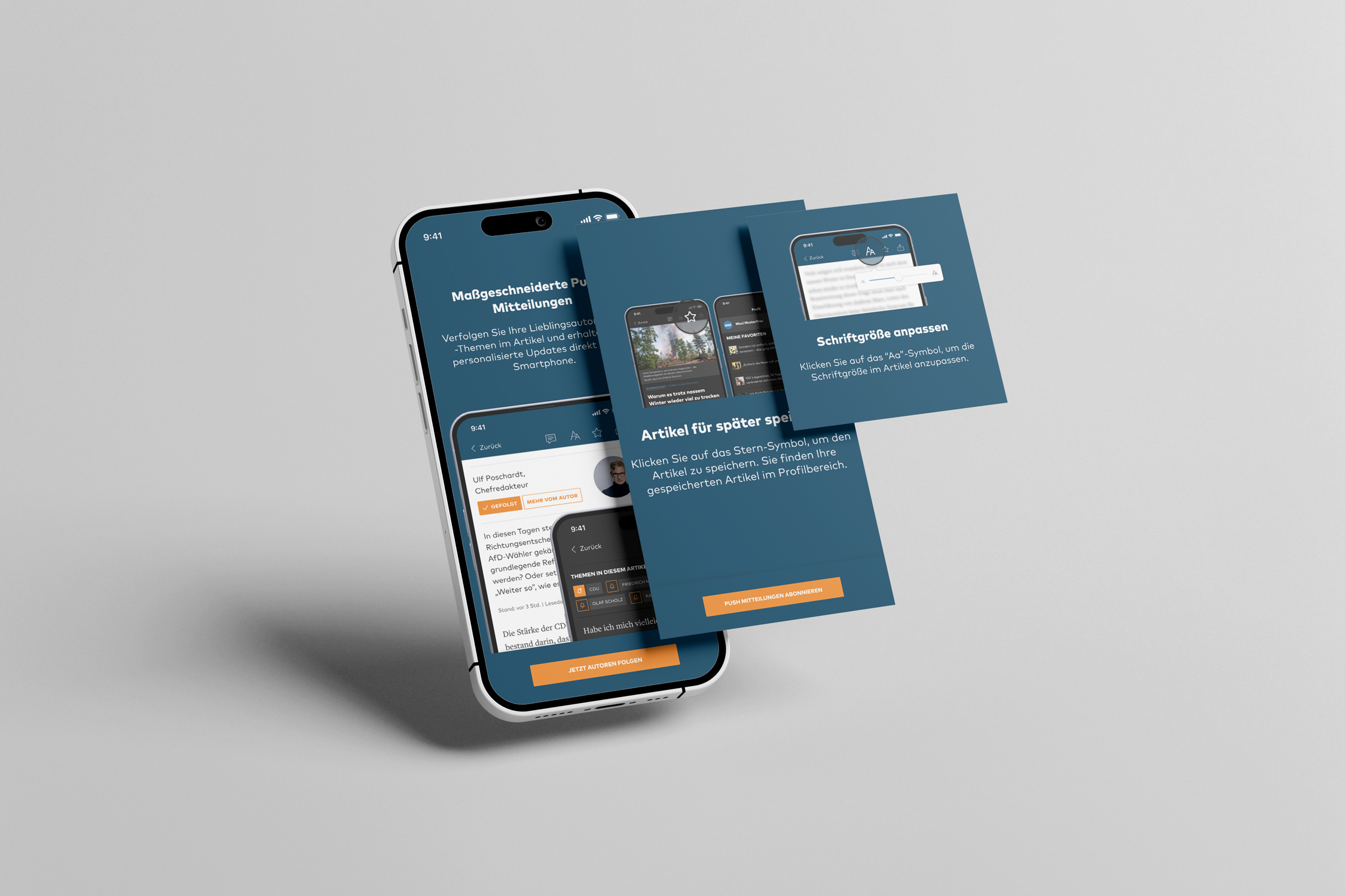 Img. 01 · iOS - Follow Authors / Save Articles / Adapt Font Size
The approach
The first constraint was the tooling. Our third-party provider Batch handled message delivery, but offered limited design flexibility — not enough to build something that felt native to the WELT brand. Rather than compromise on quality, we decided to build a custom HTML/CSS template that could be served through Batch while giving us full control over layout, typography, and interaction.
I wrote the base template together with a developer, then adapted and individualised it across every use case. Each message was designed for its specific context — the tone, the visual hierarchy, and the call to action all adjusted to fit what was being promoted.
Format was a deliberate decision too. Some messages were displayed fullscreen — for moments that warranted full attention, such as the first-install welcome or push notification opt-in. Others appeared as smaller overlays, sitting lightly over the reading experience without interrupting it. The choice of format followed the weight of the message.
The template was also built to serve platform-specific visuals — Android and iOS each received individually adapted designs within the same codebase, respecting the visual conventions of each platform without maintaining two separate templates.
Timing was as important as design. We used event-based triggers to control when messages appeared: after a set number of articles read, on first app installation, or at other defined moments in the user journey. The logic was simple — a well-timed message feels helpful; a poorly timed one feels like noise.
The features we promoted across the campaign:
— Adjusting article font size
— Following authors
— Following topics
— Enabling push notifications
— A general welcome message on first install
— Personalising the home screen
— Saving articles to favourites
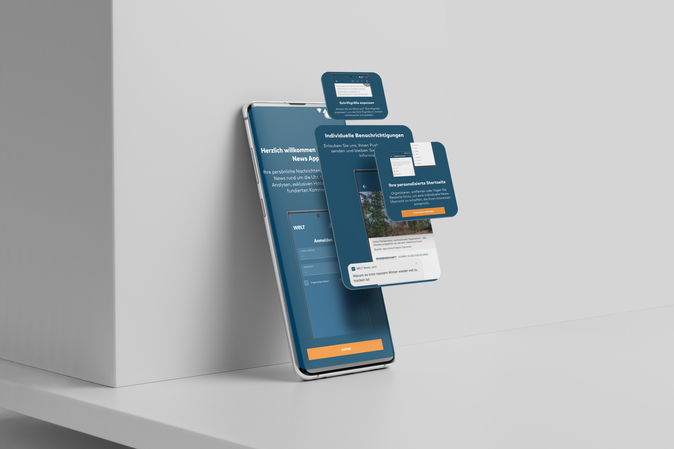 Img. 02 · Android Messages
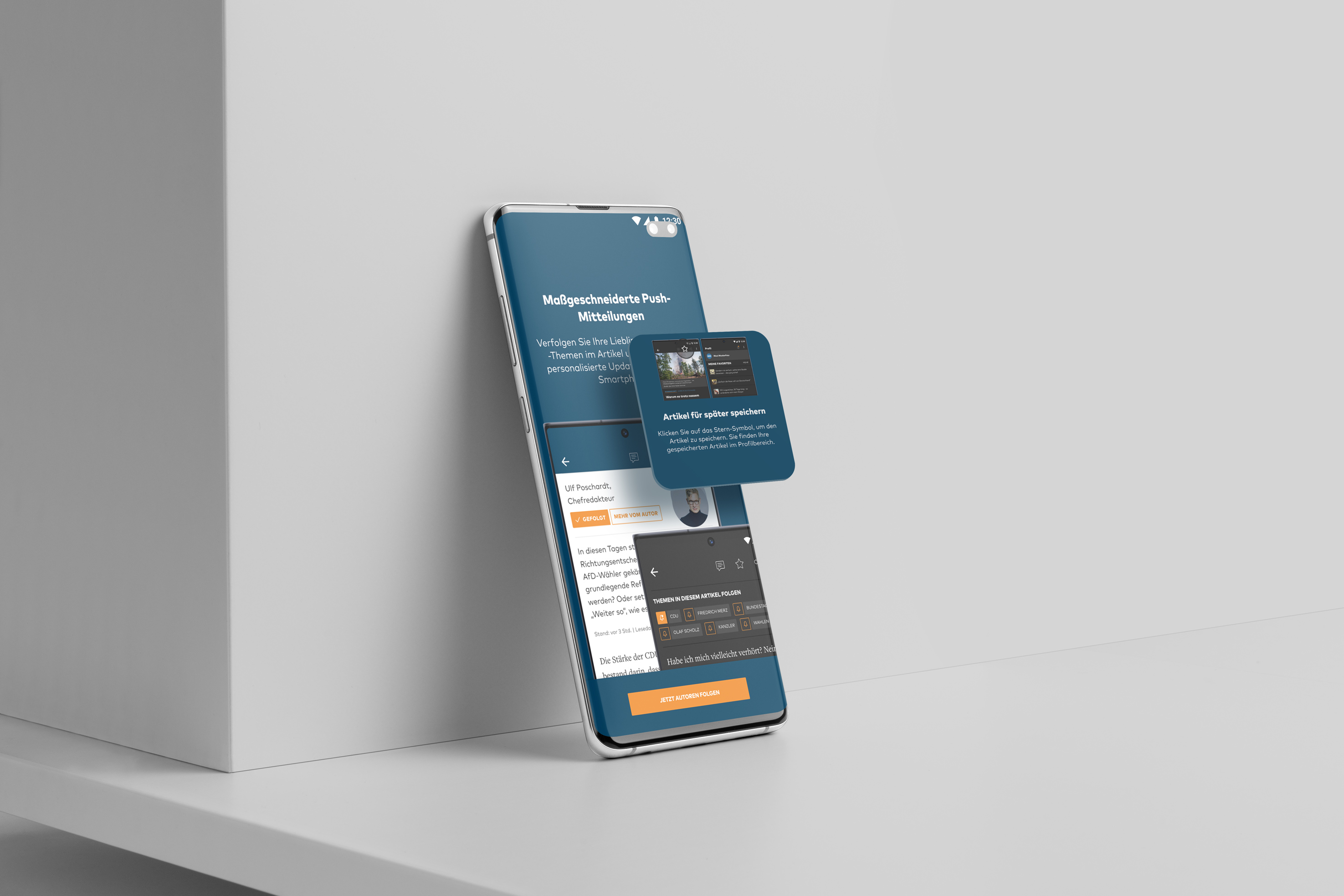 Img. 03 · Android Messages
The outcome
A flexible, on-brand in-app messaging system built on a single HTML/CSS foundation — adaptable to any future feature promotion without rebuilding from scratch. The event-based trigger logic ensured messages reached users at moments of genuine relevance, reducing friction and increasing the likelihood of adoption.