WELT Edition Rebrush
Redesigning the WELT Edition across every platform — cleaner, closer to the brand, and achieved without touching the technical foundation.
The brief
A redesign built around what couldn't change — and everything that could.
The WELT Edition needed a full redesign — but with constraints that shaped every decision. The technical foundation was owned by an external partner, which meant preserving as much of the existing base as possible: image crops stayed identical, core structure remained intact. The goal was to get maximum visual impact from minimal technical change. A cleaner, more modern look and feel, closer in spirit to the WELT News App — without a rebuild.
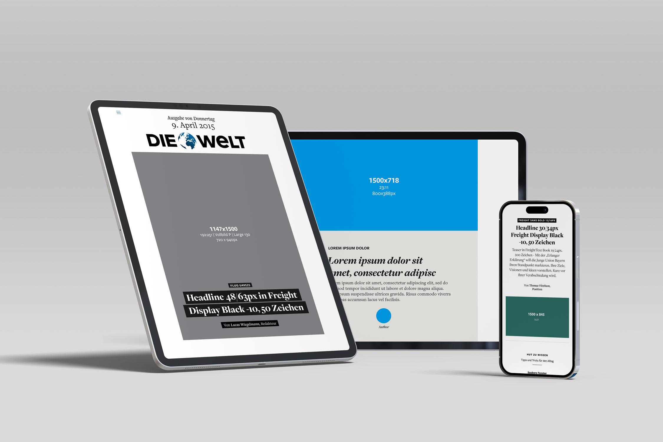 Img 01 · The previous design
The approach
The project began with a freelancer who designed the iPad experience. I took over from there, building the responsive design across all remaining platforms — and ensuring both worlds shared the same design foundation.
The iPad version is the Edition's centrepiece. It's where the largest share of readers engage with the product, and where the format earns its name: content is paginated, fitting precisely within the viewport in both portrait and landscape. Reading feels like turning pages — deliberate, contained, editorial.
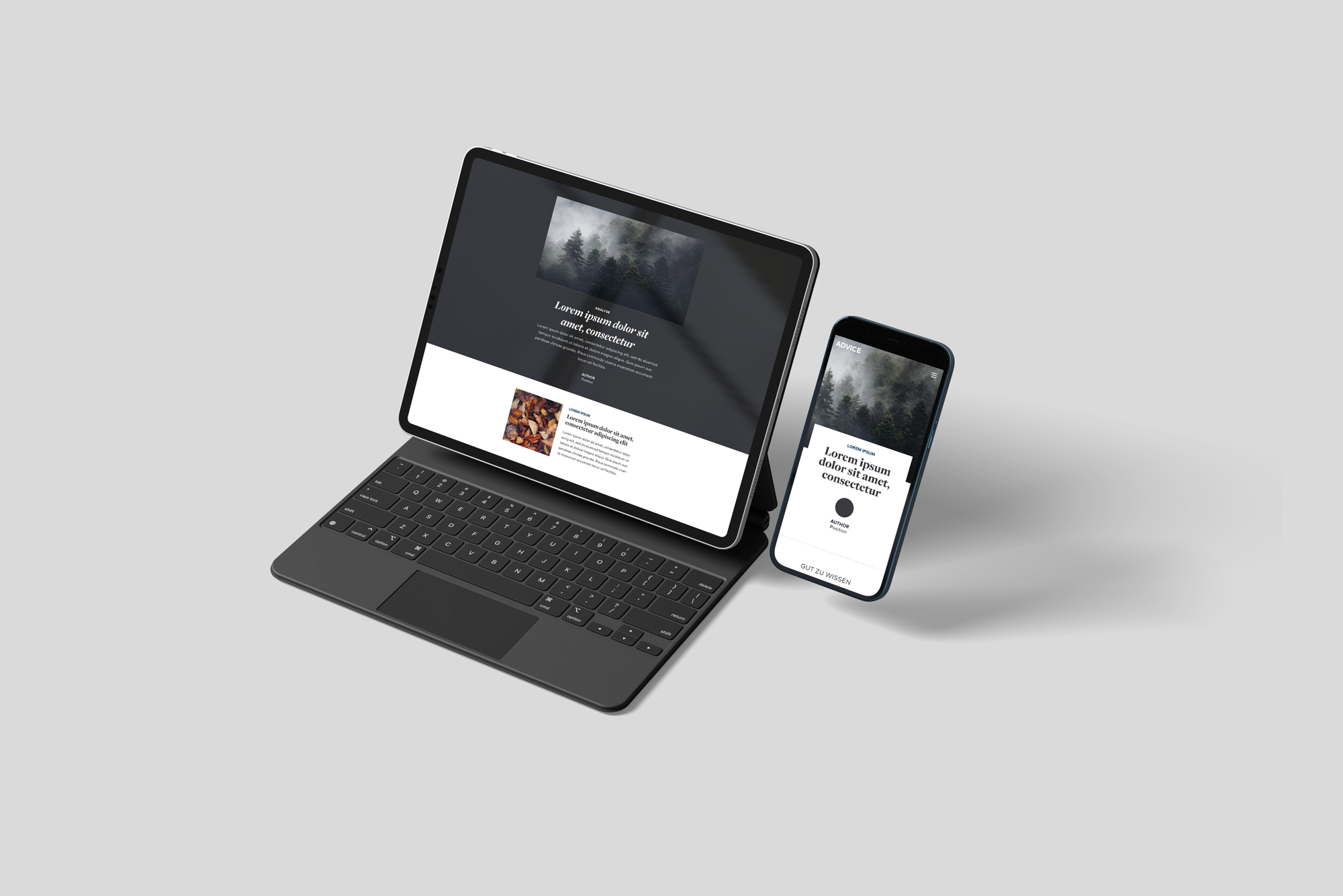
On responsive, the content shifts to a vertical scroll — a single-column layout that moves through stories linearly. The visual language stays consistent: same type scale, same colour logic, same underlying grid. Different behaviour, same identity.
The design changes themselves were focused and deliberate. Blues were unified. Typography was standardised to align with the WELT News App. Anything decorative that didn't earn its place was removed. The result is a cleaner, quieter layout that lets editorial content lead.
Working within tight technical constraints — and across a 1.5-year timeline — meant making every decision twice: once for what looked right, and once for what was actually buildable without pulling in the external partner for every change.
I like the fresh, slightly refined design. [...] — App Store User Review, 2022
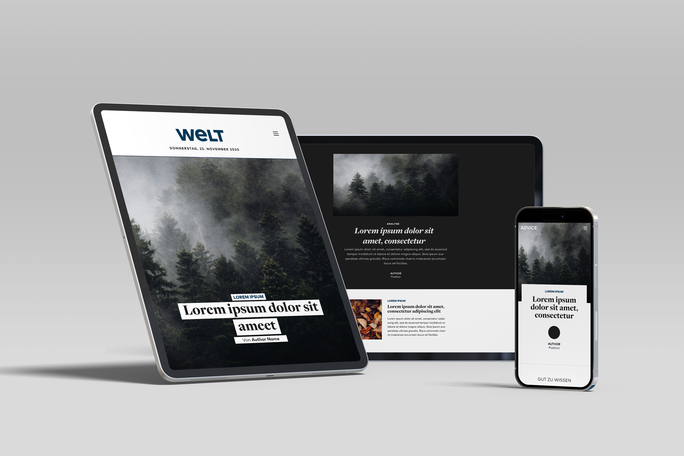 Img 02 · After — refreshed across devices
The outcome
A fully redesigned WELT Edition that reads consistently across platforms — paginated and precise on iPad, scrollable and clean on all others. Closer to the brand, lighter in execution, and achieved without a ground-up rebuild.