User Comment Integration
A native implementation of WELT's comment feature for the News App — from initial concept through design to user testing.
The brief
Your comments, wherever you read.
WELT's comment section existed on the web — but not in the app. Readers who engaged with articles, responded to other users, or built up a comment history had no way to access or manage that activity on mobile. The brief: bring the full comment experience natively into the WELT News App, without simply porting the web interface across.
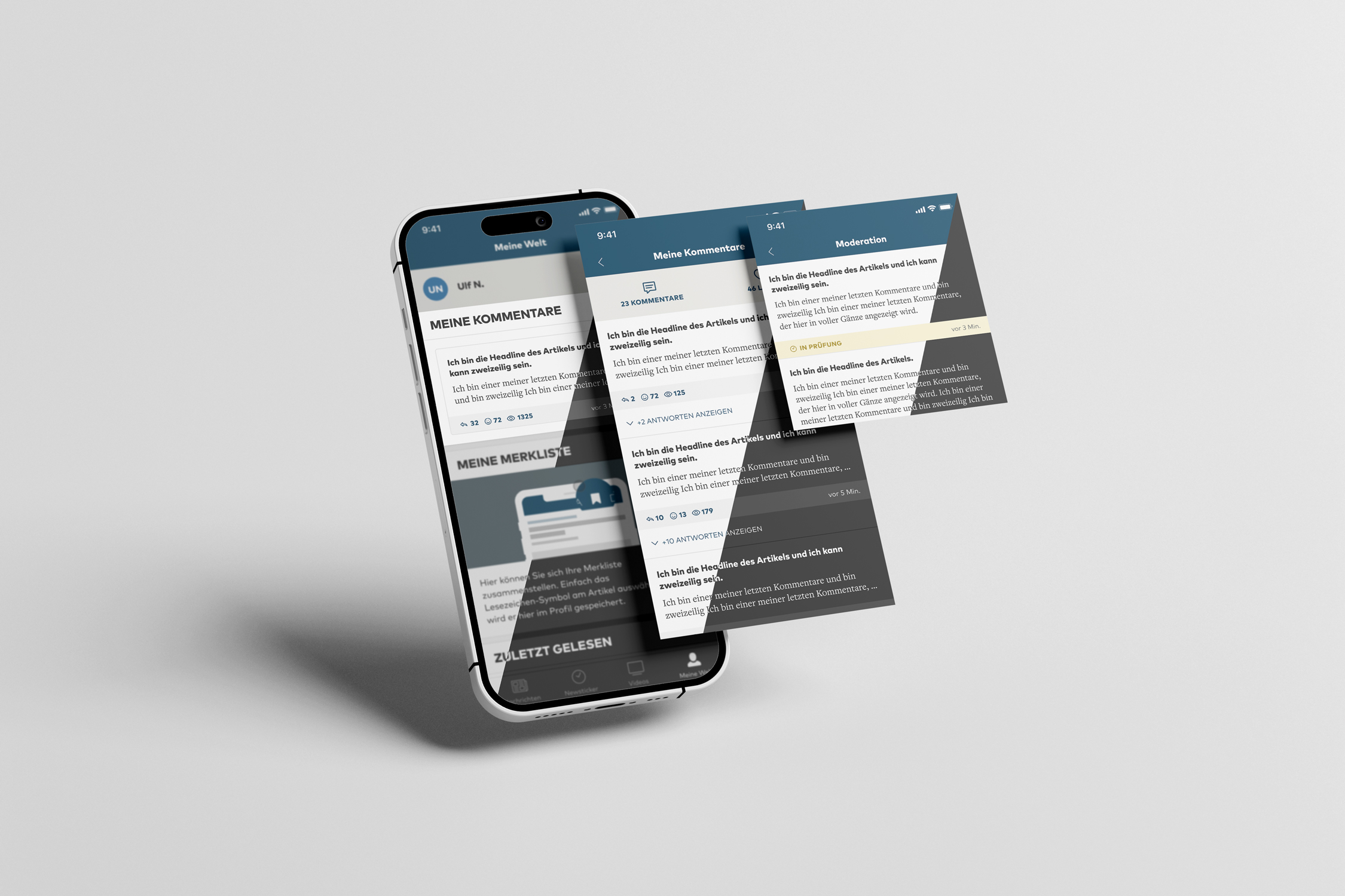
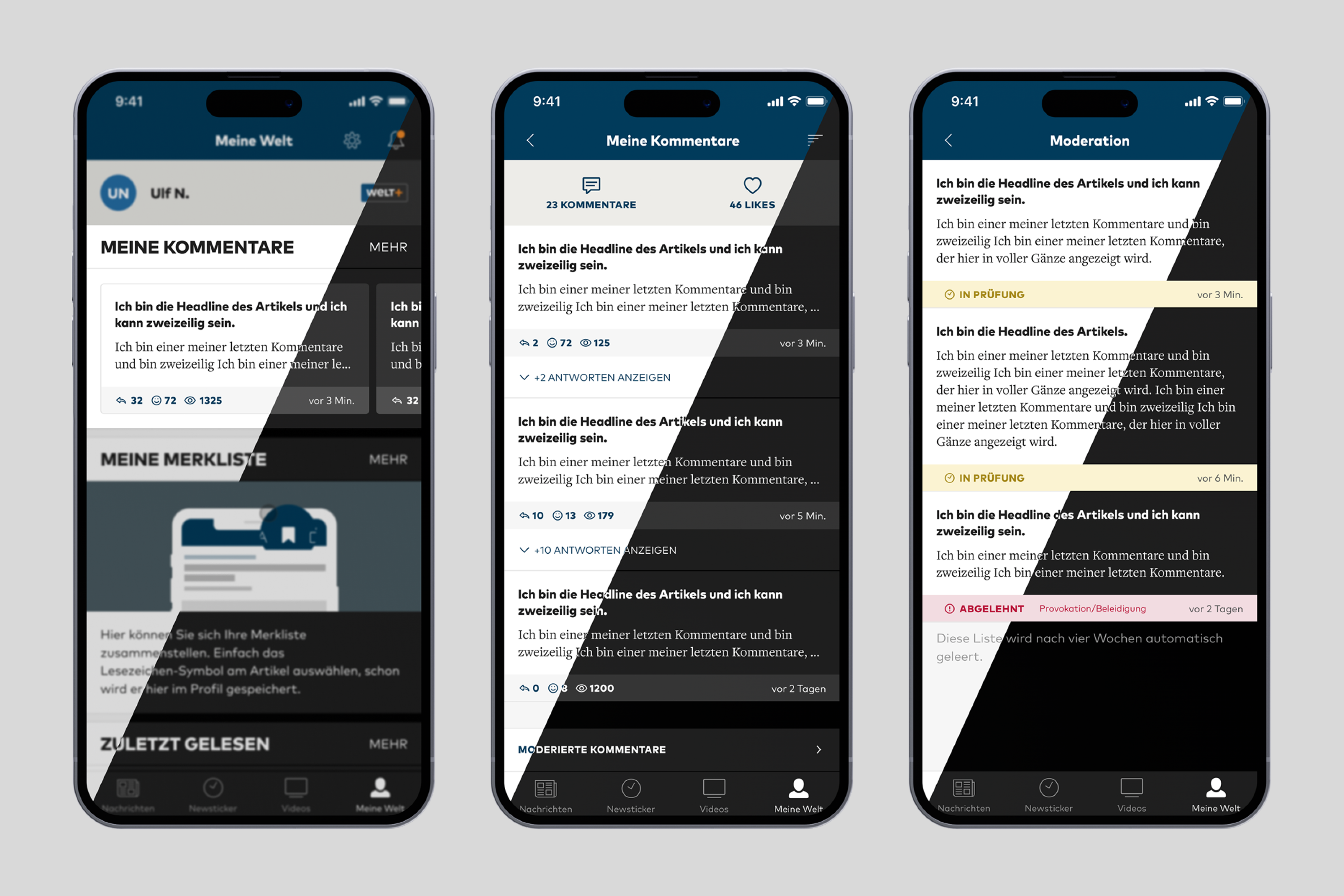 Img 01 · Default Profile / Comments Overview / Unpublished Comments
The approach
The starting point was the user profile. The first viewport shows the ten most recent comments a user has written — enough context to feel personal, light enough not to overwhelm. From there, a single tap on "Mehr" opens the full comment history. In the expanded view, users can sort their comments three ways: by most likes, most replies, or most recent. Replies to their own comments are surfaced inline — so a conversation doesn't require hunting across articles to follow.
A persistent bottom bar gives access to unpublished comments — those still awaiting moderation. Here, users get full transparency into the status of each submission: comments flagged in red have been rejected, with a visible reason attached; those highlighted in yellow are still under review. It's a deliberate design choice to surface this information rather than leave users wondering why a comment never appeared.
A short pull quote — a line from a brief, a review, or a teammate. — Attribution, 2022
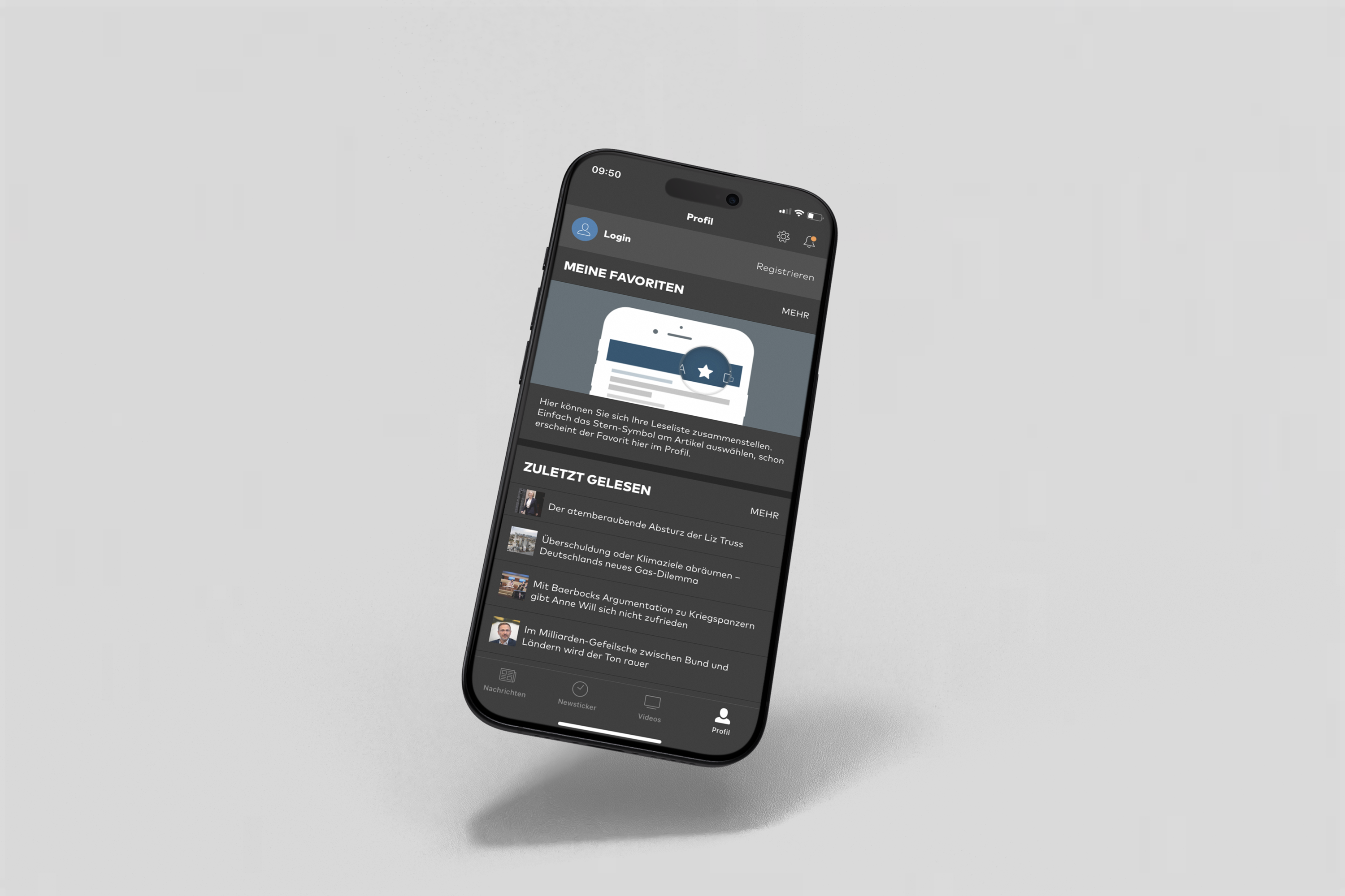 Fig. 02 · Before — profile without comment surfaces
The outcome
The design challenge was less about adding features and more about making existing behaviour feel native. Web patterns that work with a mouse and a wide viewport don't always translate to a thumb and a small screen. Every interaction was reconsidered from the ground up — tested with real users and iterated based on what we observed, not what we assumed. Throughout, I worked closely with development to ensure the concept was buildable, the handoff was tight, and the implementation matched the intent.